We are a design practice that specialises in delivering high-impact graphic design supported by sound marketing principles. Our expertise is in brand design and visual identity systems for business.


Making brands
visible™
We are a design practice that specialises in delivering high-impact graphic design supported by sound marketing principles. Our expertise is in brand design and visual identity systems for business.

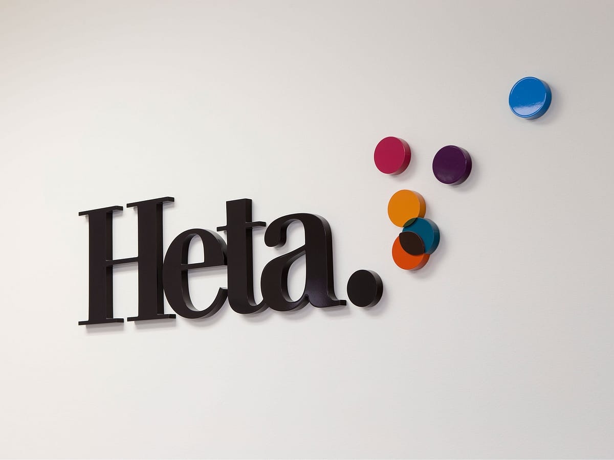
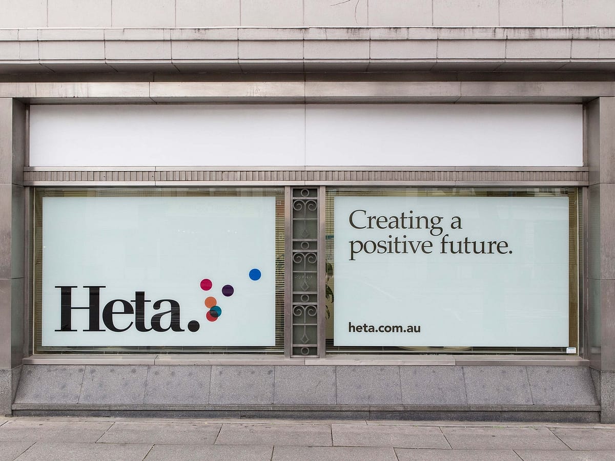
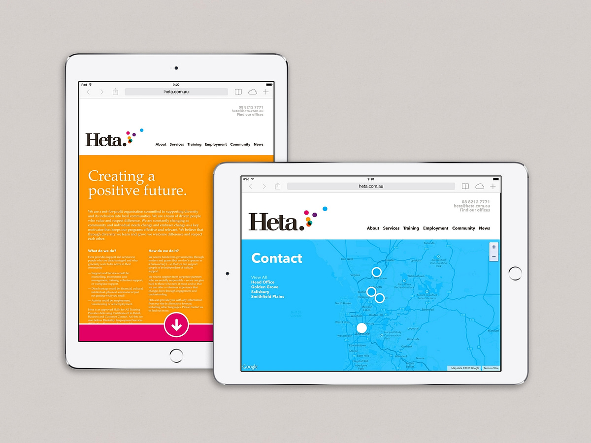
Heta Incorporated had a logo that was incongruous with the optimistic outlook of their activities. Their name was an acronym for out-of-date terms no longer socially acceptable but their brand had a lot of equity in the market place.
Our design turned the name into a proper noun, with the full stop at the end of the word reinforcing this concept while also providing an anchor point for the creative flourish of multiple coloured dots moving upwards and forwards. The overall sense of the identity is one of positivity and optimism.
