1999 –2024
After 25 years of making brands visible, sector7g has become part of Super Studio.
This website will remain as an archive of our work.
Making brands
visible™
1999 –2024
After 25 years of making brands visible, sector7g has become part of Super Studio.
This website will remain as an archive of our work.

The Australian Fabians had an image problem. The average age of their membership was around 65 and their numbers where dropping every year. The organisation, boasting names such as Gough Whitlam, Don Dunstan and Paul Keating amongst its members, were not seen as relevant to the younger progressive thinkers it was trying to attract.
Often mistaken for being a ‘green’ group, (their original logo was a stylised symbol of a turtle in a green oval), they needed a refocussing of their organisational branding to speak to a younger audience.
Through a thorough research phase, we distilled their core essence down to three words: Equality. Full stop.
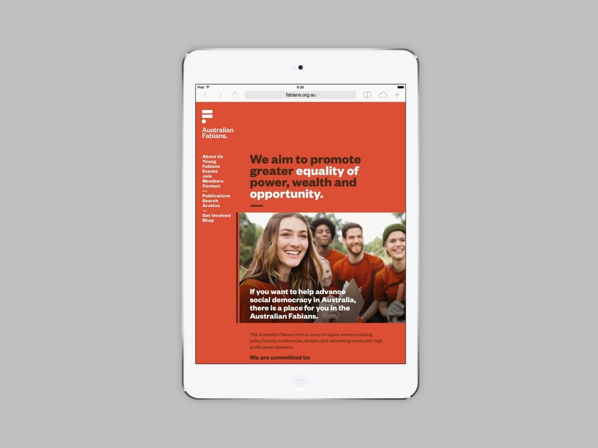
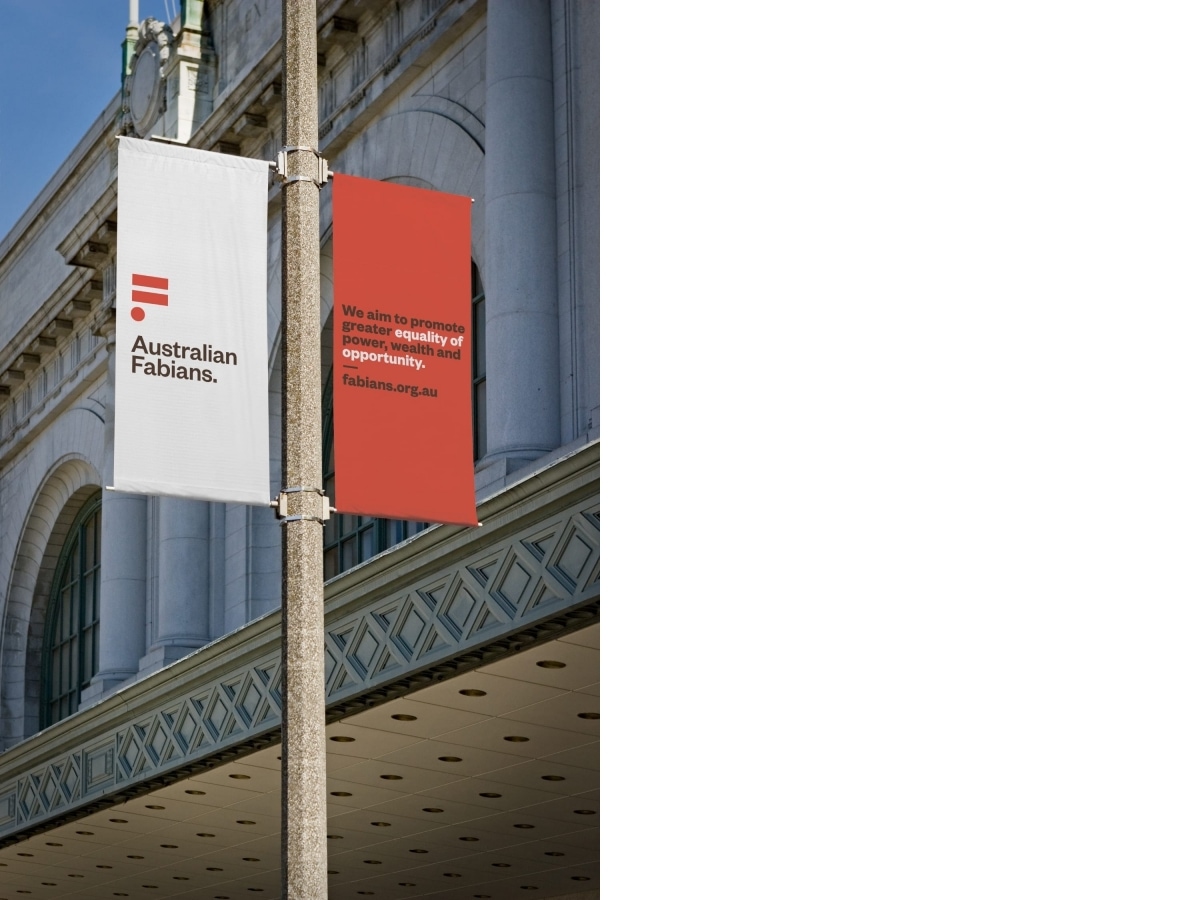
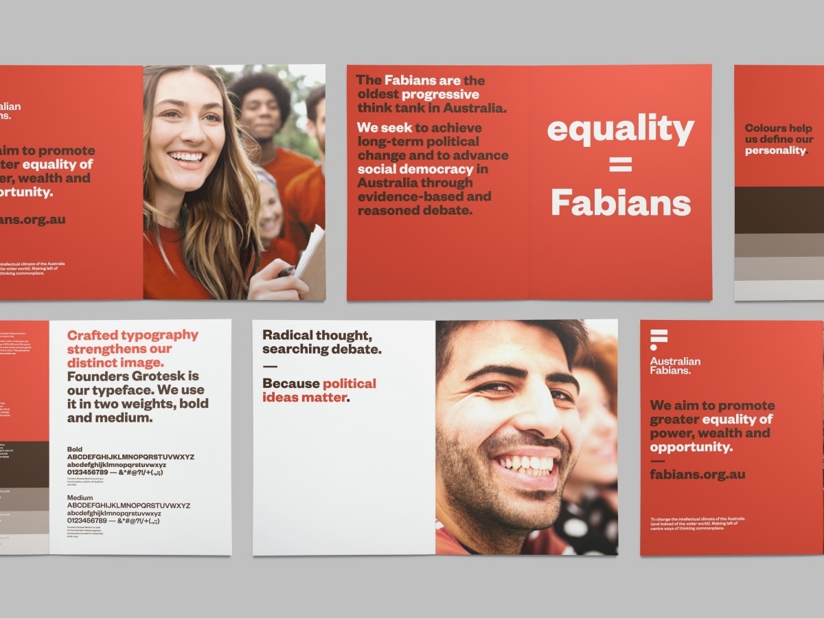
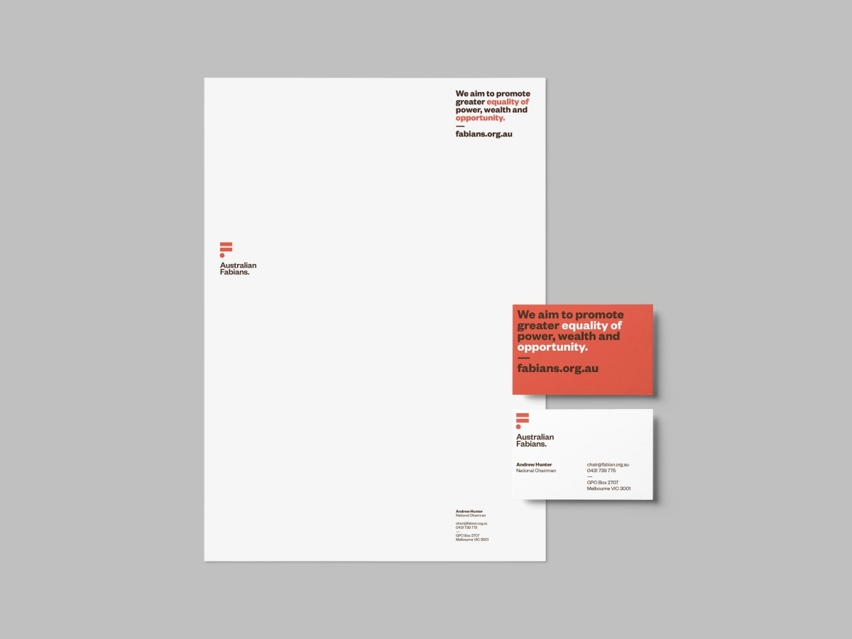
The logo is a stylised letter F made from an equal sign and a baseline dot, reinforcing the key message of equality and to create a monogram that was instantly recognisable and appealing to a younger audience. The use of burnt orange was to distance the organisation from any one political party and a loose reference to the Australian outback.
A system of highlighting words and phrases within larger paragraphs was devised to provide an easy way to draw newcomers to the Fabian philosophy without bombarding them with overly academic texts. The main paragraph, extracted from their constitution, reinforces the meaning behind the new mark.


“Within 12 months of the rebrand we broke a 7 year record for memberships, increased our Young Fabians membership by 84%, as well as dropping our average age of members by 10 years.”
Roger Byrne
National Secretary
Australian Fabian Society Inc.


