1999 –2024
After 25 years of making brands visible, sector7g has become part of Super Studio.
This website will remain as an archive of our work.
Making brands
visible™
1999 –2024
After 25 years of making brands visible, sector7g has become part of Super Studio.
This website will remain as an archive of our work.

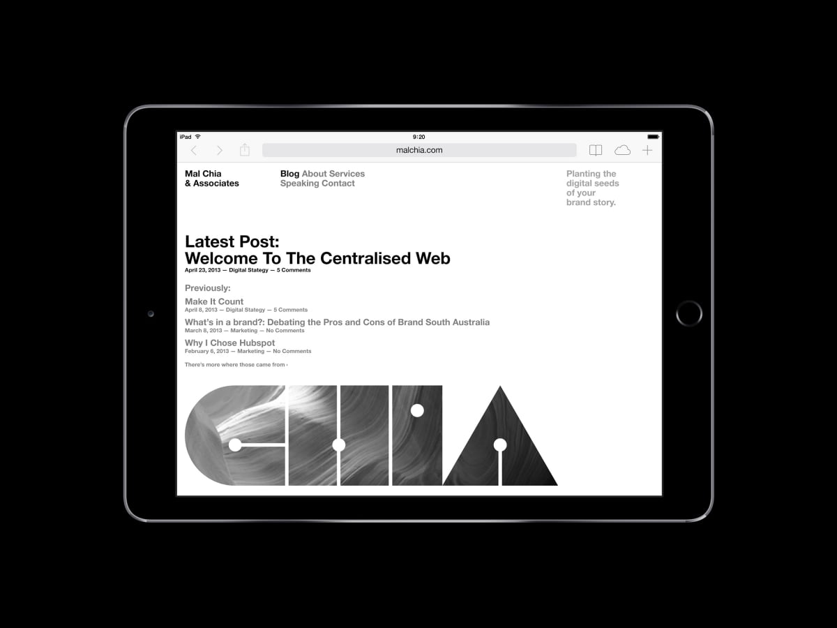
Mal Chia is a digital strategist who consults to organisations on their digital marketing requirements. He wanted an identity that made him stand apart from his competitors in an industry that was not entirely trusted by the market.
We proposed building trust by using his surname as the brand. Big bold and upfront. No hiding behind an abstract name or pretending he was a larger organisation. Honestly portraying himself as a single consultant that works as a part of your team set the scene for engendering trust with his new clients.
The logotype was design to be highly graphic but still legible with reference to information graphics and data maps as well as having a subtle set of black dots to reinforce the seed connection.
A completely monochrome colour scheme in black, white and silver was used to create a distinct look. Print production included white foil stamping and metallic inks on premium black stock to lift the black and white aesthetic to a premium level.


