1999 –2024
After 25 years of making brands visible, sector7g has become part of Super Studio.
This website will remain as an archive of our work.
Making brands
visible™
1999 –2024
After 25 years of making brands visible, sector7g has become part of Super Studio.
This website will remain as an archive of our work.

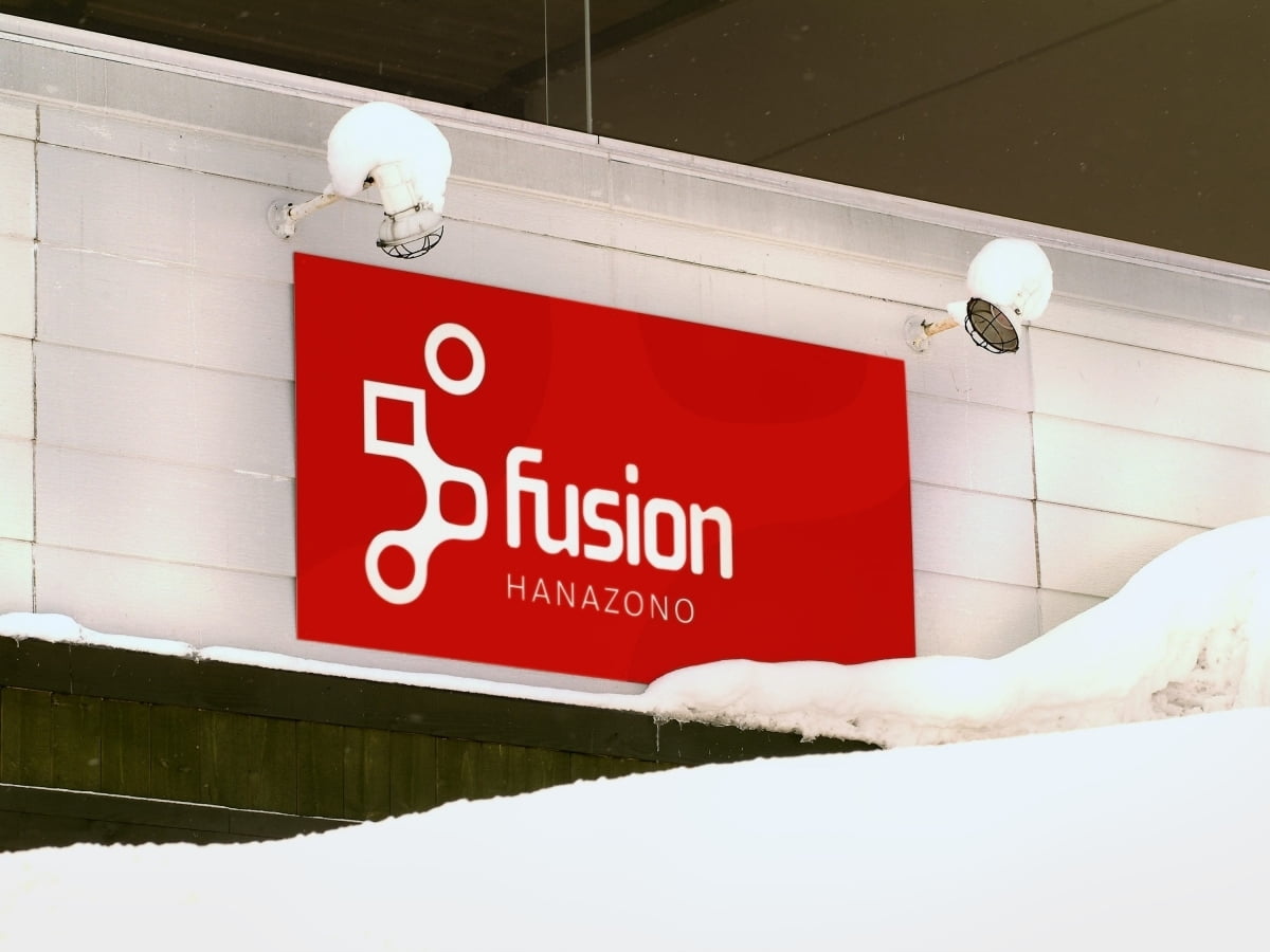
We worked with Nihon Harmony Resorts, a Japanese Ski Resort Developer, for several years to develop an overarching brand strategy and visual identities for Hanazono, a newly developed ski village in Niseko. Included branding and marketing collateral for the suite of services being offered in conjunction with the development as well as environmental graphics, website development and motion graphics for their online TV station.
The Hanazono logo is a synthesis of the Kanji symbol for mountain and the letter H.
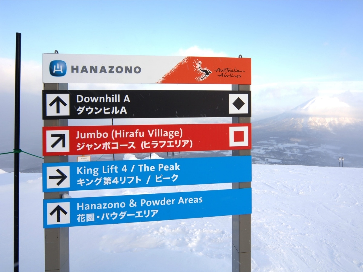
We were also engaged to design and produce on mountain trail signage for their area, using a simple ladder-segment system that allowed for the almost 6 metres of snow that builds up over a season. This system quickly became the standard for the entire mountain range.


