1999 –2024
After 25 years of making brands visible, sector7g has become part of Super Studio.
This website will remain as an archive of our work.
Making brands
visible™
1999 –2024
After 25 years of making brands visible, sector7g has become part of Super Studio.
This website will remain as an archive of our work.
We were engaged by Media Resource Centre and Mercury Cinema to guide them on a rebrand of the merger between the two entities for a new phase of the organisation. Our process of discovery led us through a few strong concepts, however one stood out from the others with its elegance and simplicity.
While this solution was never implemented (it didn’t get past the final approval stage), we felt strongly about its suitability for this cultural icon of Adelaide’s film community and wanted to include it in our body of work.
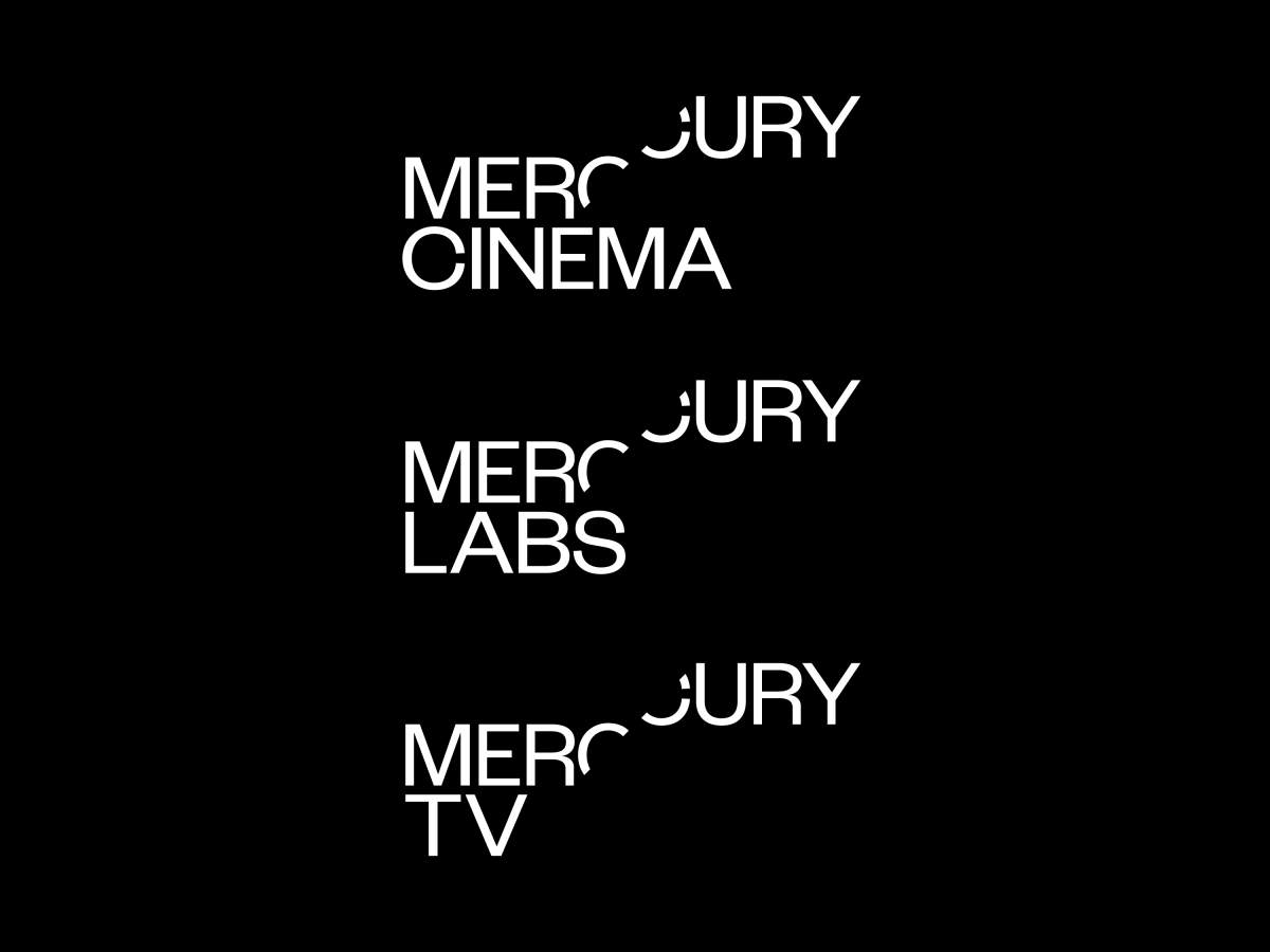
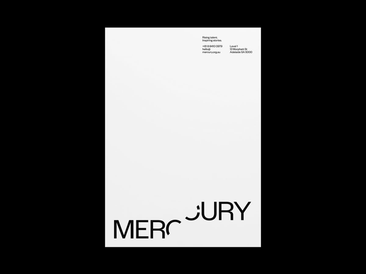
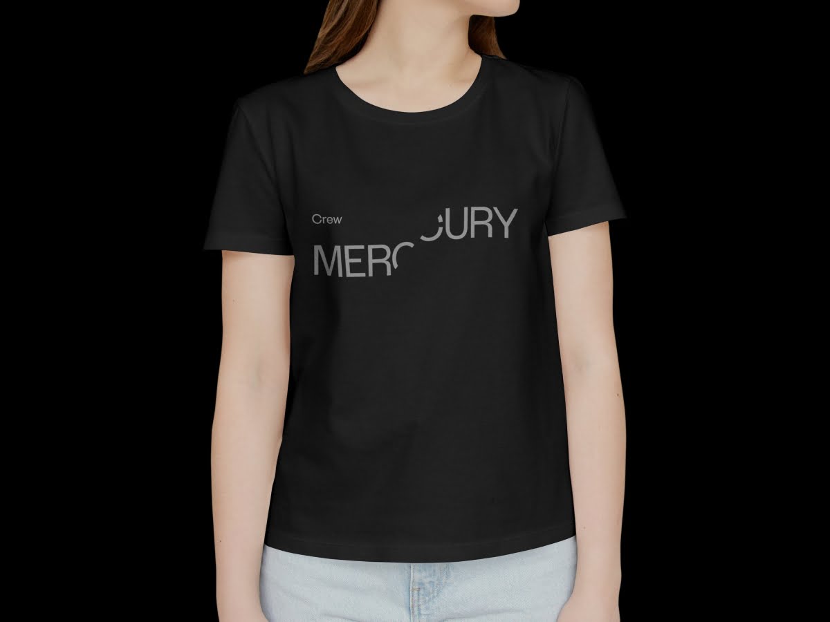
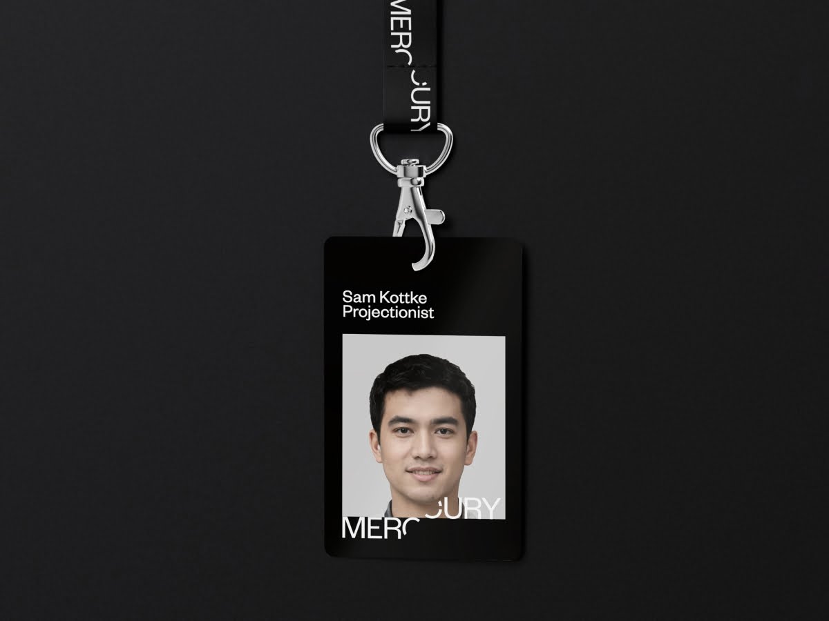
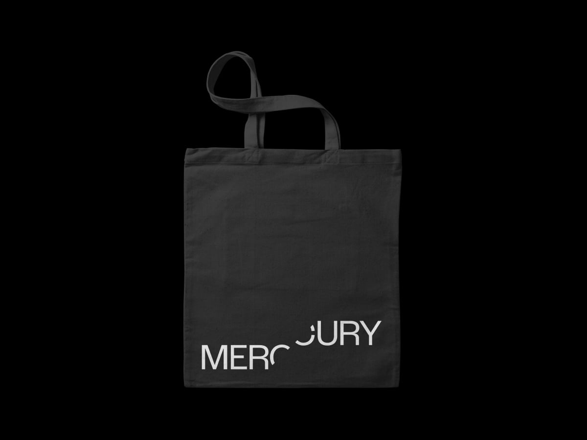
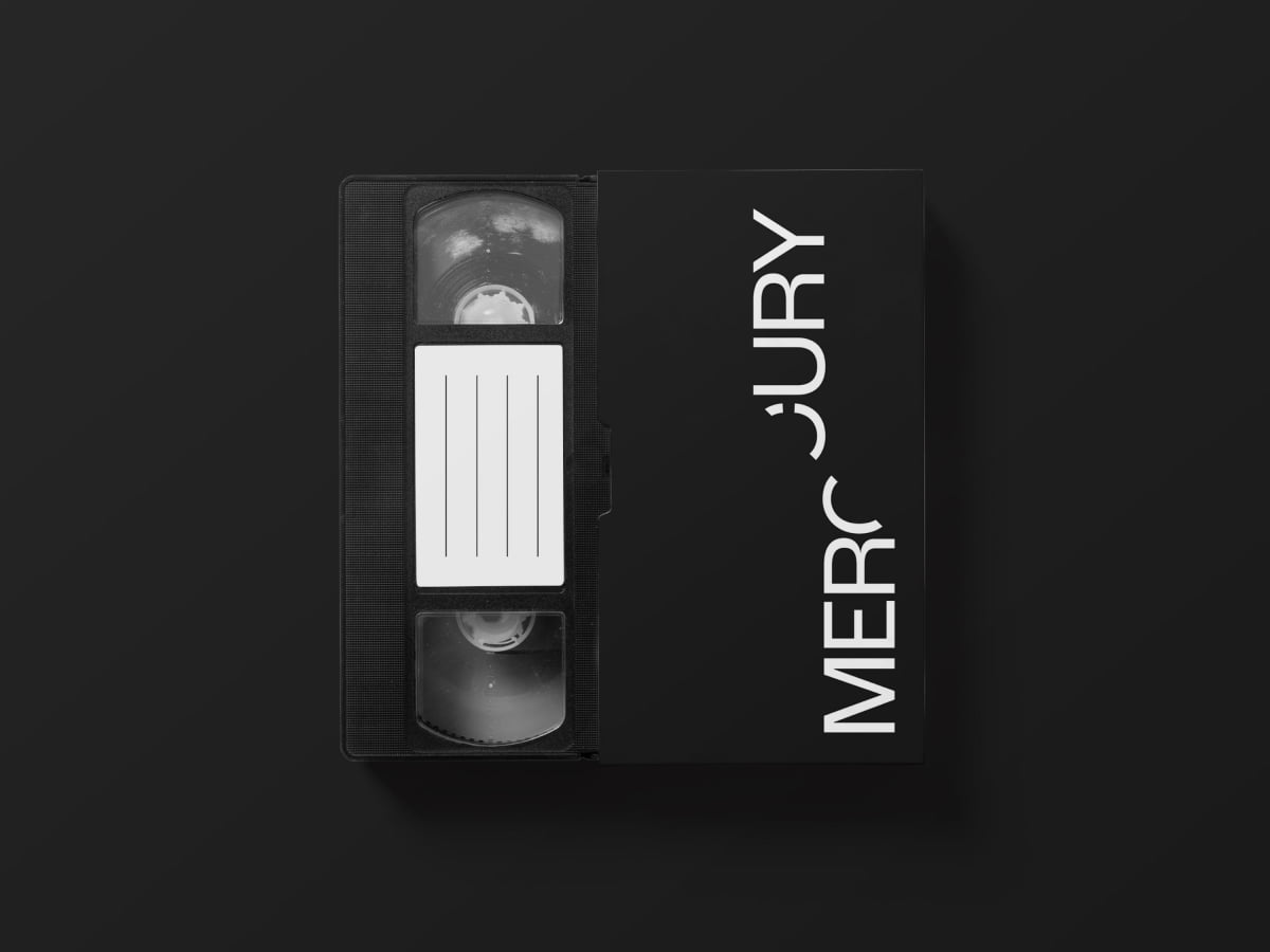
Our simple typographic solution to convey the concept of Mercury Rising was a nod to the strategic plan of the board to elevate the organisation, and much loved cinema, back to its rightful place as a leading institution for the South Australian film industry. It also reinforced the positioning of the brand; Rising Talent. Inspiring Stories.
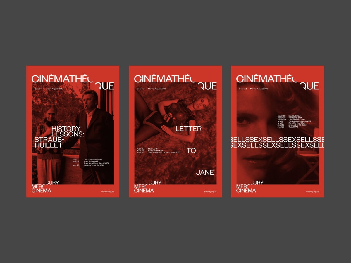
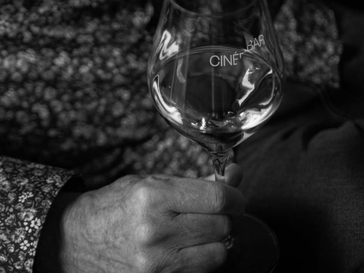
A strong but elegant typographic structure formed the basis of the brand identity and allowed a series of pre-existing sub brands to be easily adapted under the same visual framework. Combined with a simple colour palette allowed the identity to sit confidently amongst the plethora of arts branding within its backyard, and to stand out as a sophisticated brand for a sophisticated audience.
The identity also allowed for a variety of image styles to be integrated into posters, flyers, and other promotional collateral, without detracting from, nor being overpowered by, the overall visual identity system.

