1999 –2024
After 25 years of making brands visible, sector7g has become part of Super Studio.
This website will remain as an archive of our work.
Making brands
visible™
1999 –2024
After 25 years of making brands visible, sector7g has become part of Super Studio.
This website will remain as an archive of our work.

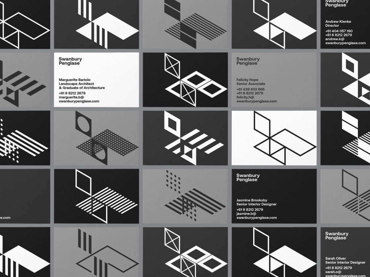
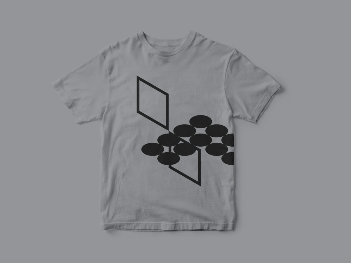
The Swanbury Penglase symbol is an abstract S and P intersecting as two isometric planes — enough to define 3D space. It has been designed as a variable symbol, with versions divided into three tiers for various usage.
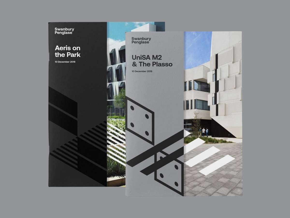
The “foundation tier” is used for formal applications. The second tier represents greater expression, referencing floorpans and rendering techniques, and is used for individual business cards for staff or case studies for individual projects.
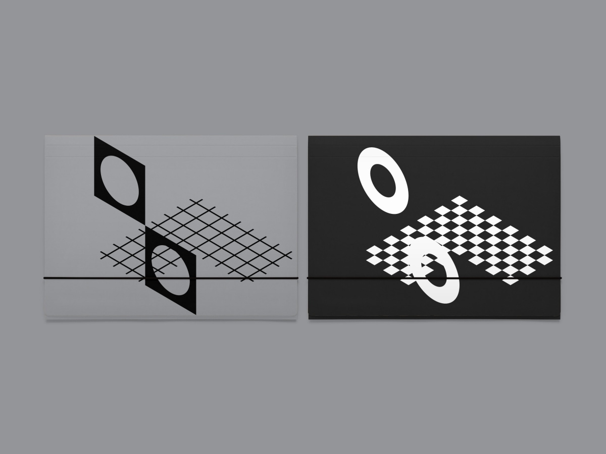
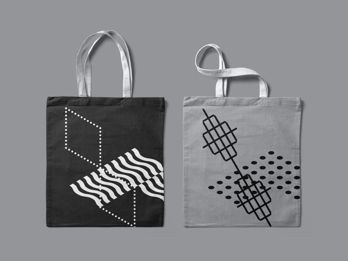
Tier 3 represents the extreme of the variable identity system. It features the greatest experimentation, pushing the legibility of the symbol, and is used internally and for cultural expression.


